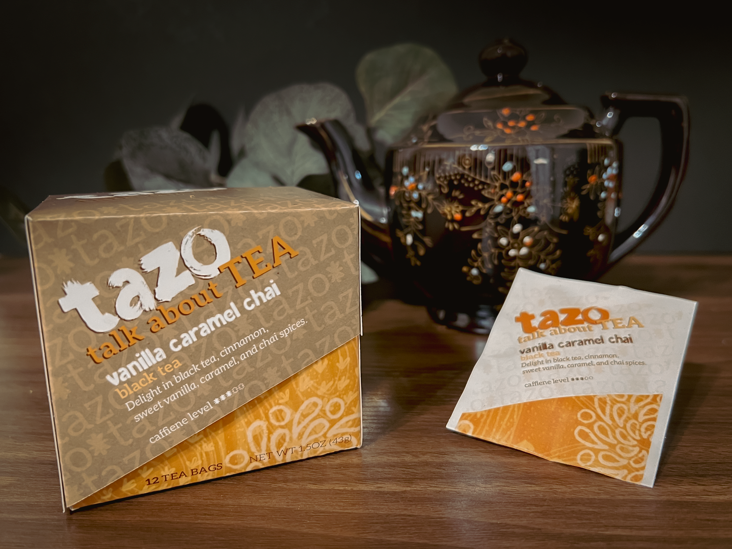
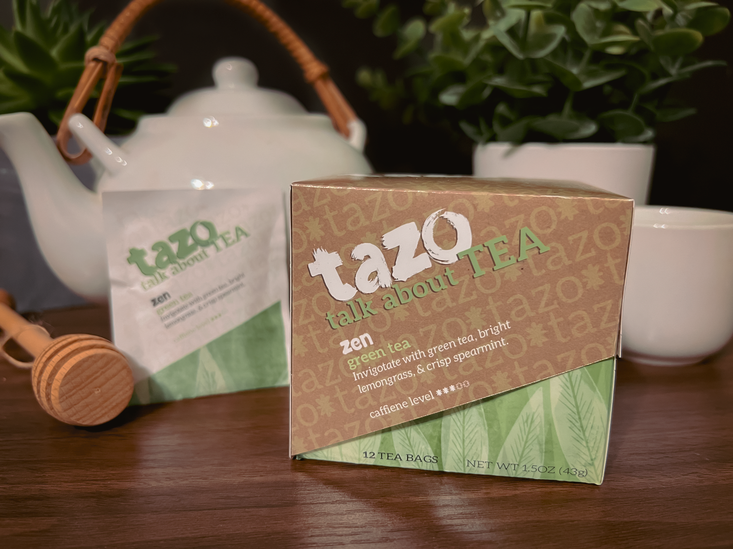
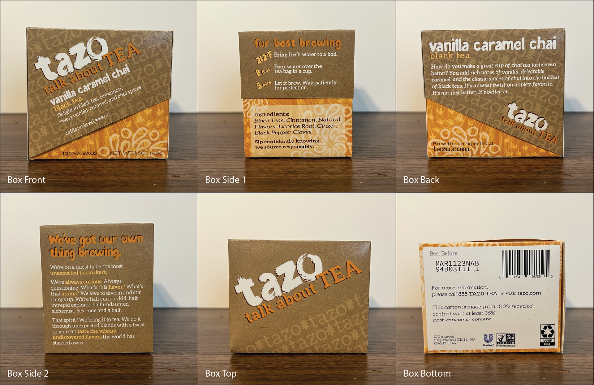
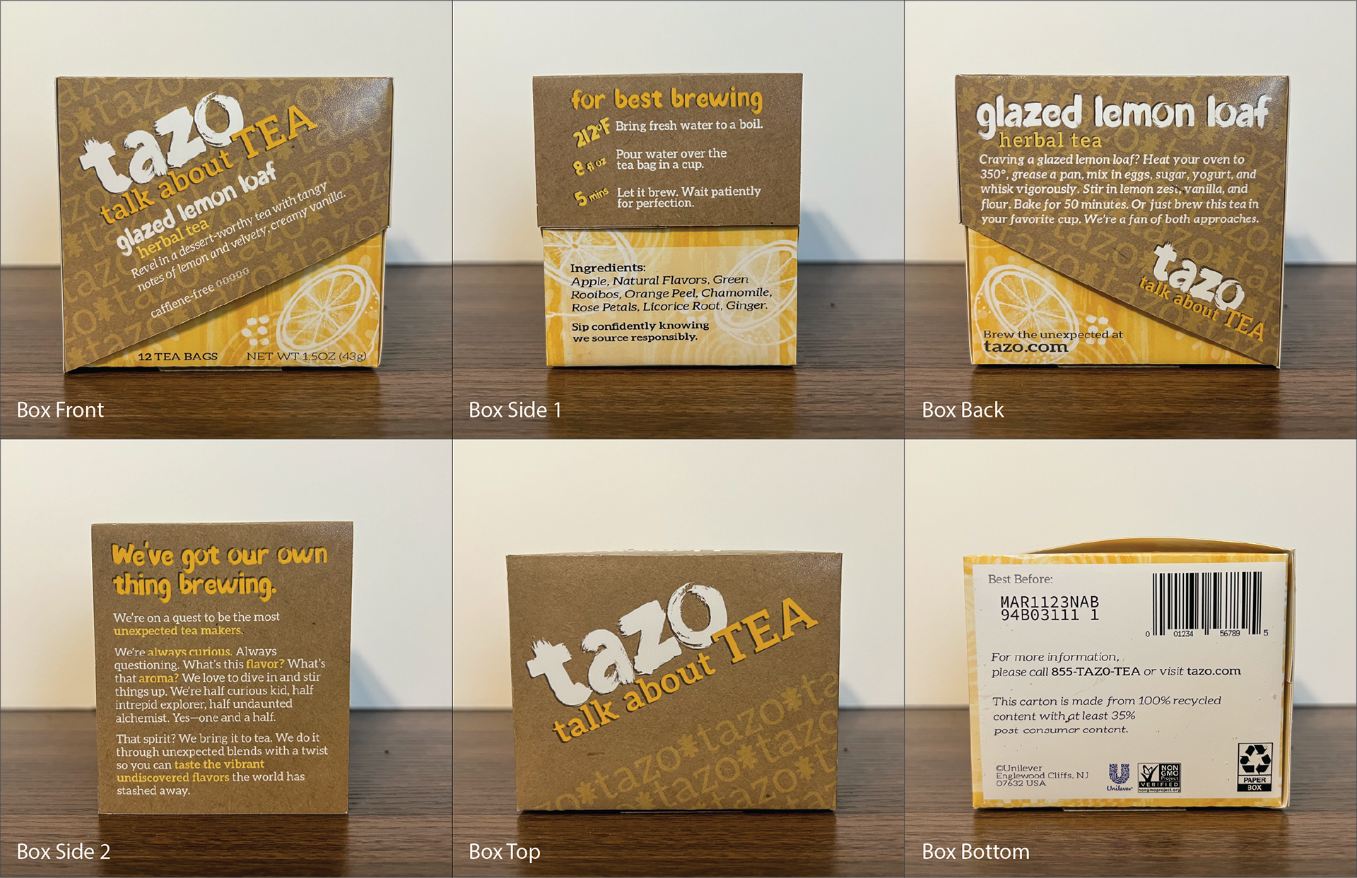
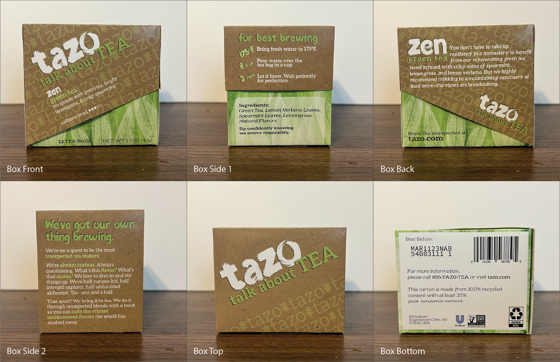
For this project, I created new packaging for one of my favorite tea brands, Tazo tea. As a typography project, I relied primarily on text and font use to carry my design, though I did draw the designs for the bases of the boxes using Procreate. I used an analogous color scheme of oranges, yellows, and greens to represent each flavor and make it easily identifiable at a glance. I also made the box so that it could be displayed on a counter or in a break room, with the flavor and brewing instructions still clearly visible. The layout for the box was done in Adobe Illustrator
